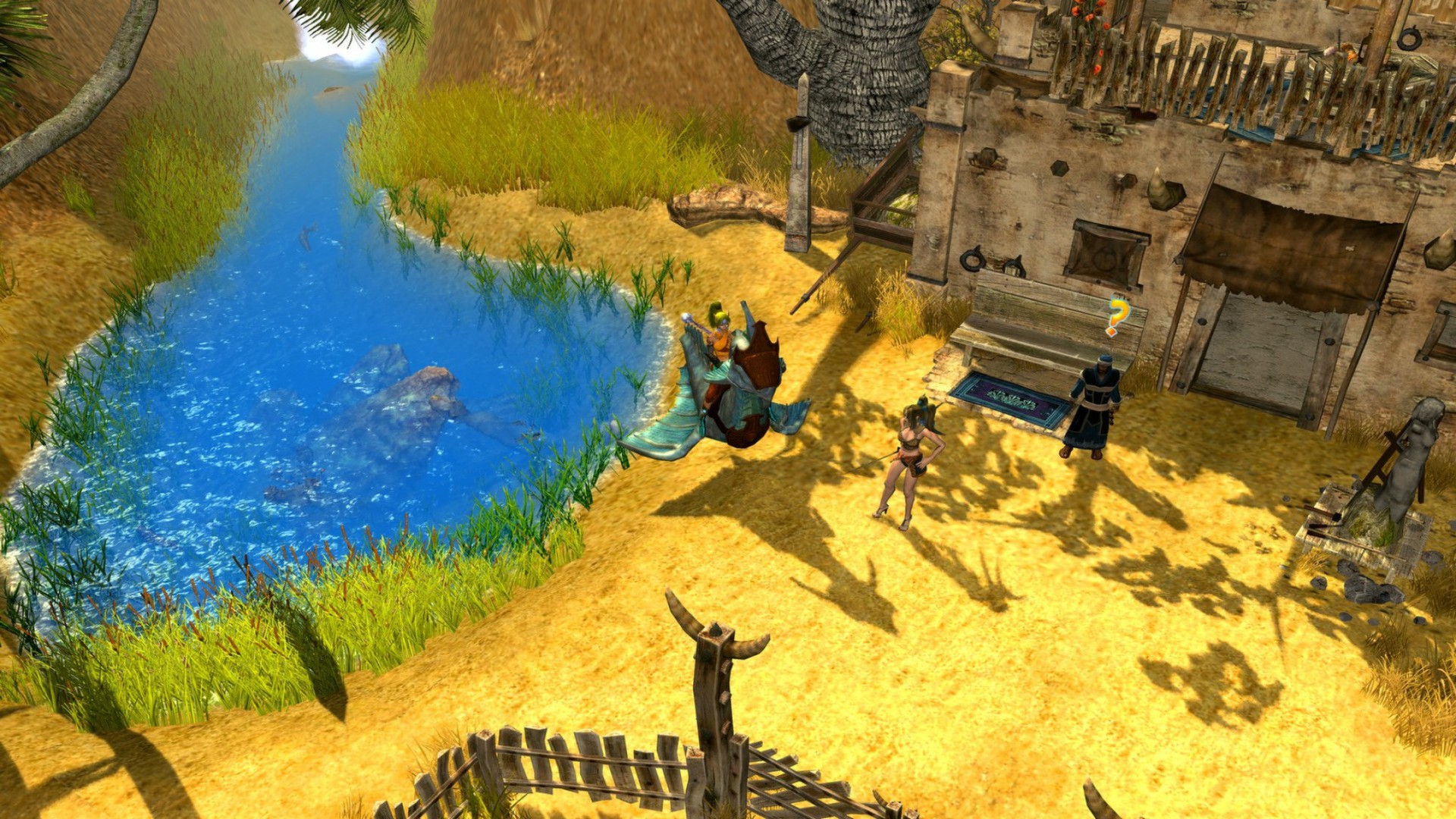
Hey y’all, how are ya? I just wanted to chime in and make y’all aware of some things I’ve added to the site. First, thanks thanks to the Organize Series plugin, my reviews — which as you know in the format of multi-article diaries — are now much better organized into series. For example, you can see that my recent SOL: Exodus articles are now arranged in a series, with simple navigation between articles. I think this will really help these reviews be more user-friendly in the future. :)
Secondly, on the advice from Janster over on Quarter to Three, I’ve added a widget to the sidebar that shows all of the upcoming previews, reviews, and eventually interviews — when I have some in the pipeline — so you can easily see what will be coming up in the next several weeks. Hopefully, both these additions will make the site more useful and easier to navigate and understand. Also, I’m always open to criticism, so if you have any, please feel free to comment here on this post, or contact me directly. Thanks for visiting, as always! :)


I really hate the news ticker thing at the top, as it messes up my scrolling. Every time I visit the site I have to move my mouse away from it first to actually scroll down.
Oh, I'm sorry, but I love that thing, so it stays. ;) If you put your cursor to the side of it you can scroll right past it. :)
Hey, lookit, I checked and was able to turn off mouse wheel scrolling. What do you think? :)
Yay! Thanks.
Sho'nuff, I'm just glad I found out that I could do that. :)
Finally I'm in the news..in space…
Hahaha, yuuuuuuuuuuuuuuup!