Yesterday we looked at the worst Heads Up Displays in the space sim genre (according to me). In today’s conclusion, we’ll look at the best the genre has to offer. I’ve played a lot of wonderful space simulations, many with great examples of Heads Up Displays, but to get us started, we need to go back to when the genre was young with…
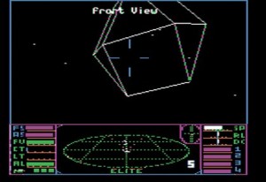
Ahhh Elite, you surly old bastard you. The second space game on the PC game I ever owned was Elite, and it really spoiled me to first person space simulations for many years. It was simple, effective, easy to understand and honestly groundbreaking. It’s been copied many times, but it’s still timeless, as the many independently-developed Elite clones will attest to.
Elite really set the stage for a revolution, not only in space gaming, but the way space games were presented. It was only right that one of the first be mentioned in this article, because it’s still one of the best.
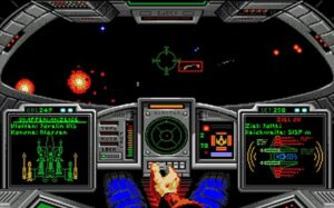
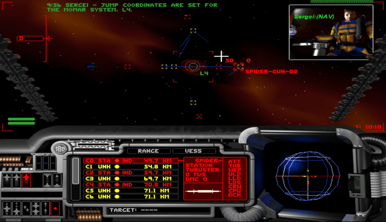
Next up is perennial genre favorite, Wing Commander. Orgin System’s 1990 release was really the first game of its kind, creating a movie-like experience of sight, sound and story that had been unmatched at the time. The success of Wing Commander also began a race by other developers to try to outdo what Origin did time and time again. The cockpit view and Heads Up Display in Wing Commander is efficient, simple and clean. There’s no question as to where everything is or what it means.
I mean, see that radar in the middle? If the dot you were following was past the outermost line on the display, your target was behind you! SIMPLE! BRILLIANT! The shield and power indicators were totally easy to understand, and the target and internal displays were JUST big enough to be useful and not get in the way. This design was repeatedly used in subsequent games, and it’s easy to see why.
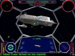
Oh Tie Fighter, you glorious example of how awesome it can be to fight for the bad guys…who didn’t seem so bad once you go to know them. I could also mention X-Wing here, but I won’t, since Tie Fighter improved upon X-Wing in every possible way, but especially in the H.U.D. Now you might notice that Tie Fighter has separate forward and read radar displays like Forced Alliance, but I think it works here because THIS game didn’t put ’em right dang next to each other. All of the other displays, such as shields, power and so on are very clear and well defined, but special mention needs to be paid to the central display. In X-Wing, this displayed useful information like a target’s distance and speed, sure…but in Tie Fighter, it was a live video feed of the target. This made it INSANELY easy to see if it was flying toward you, away from you, on a parallel course, or whether it was being attacked. This display added so much to the situational awareness of the game that it was silly, and it’s still the best of its kind, in my opinion. For a while, Tie Fighterwas not only my favorite space game, but my favorite game period, but maybe five years later, it was to be dethroned by a game that outshone it in nearly every way…
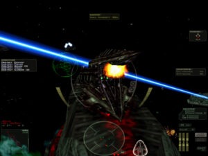
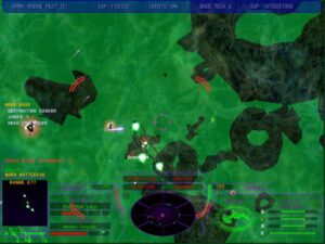
Volition, the designers of Freespace 2, were very smart in the creation of its Heads Up Display. It’s as if they took everything that had been done correctly in the past and melded it into a whole that still is the best H.U.D. in any space sim I’ve ever seen. I mean look at it, it all makes sense, and is so simple…
The weapon and afterburner power indicators make sense…the power control indicators make sense…the shield display makes sense and the radar makes sense. It all just comes together to form what is the best example of its kind, and an unmatched example of situational awareness and unobtrusiveness. Because it gets rid of the cockpit view and makes everything slightly transparent, nothing is ever in the way of you finding and killing your target.
If they’d just stopped there, that would’ve been enough. However, Volition also added a simple objective list, escort list and damage indicators not just for your craft but your fellow pilots, all within easy reach. This meant all you had to do was glance over for a nanosecond and see the relevant information you needed, whether it was an escort’s shield strength, or the overall damage of your wing.
Overall, Freespace 2 took nearly twenty years of design and technology and crafted the most useful, most beautiful and most intuitive H.U.D. in any space game, bar none. Even space sims that have come since have never matched its power and simplicity.
So there you have it, the best and worst Heads Up Displays in space sim gaming, according to me. I hope you enjoyed this first set of articles, because I have plenty more planned. If you disagree with any of my choices, or want to chime in with your own, I’d love to read about them in the comments. Thanks for reading! :)
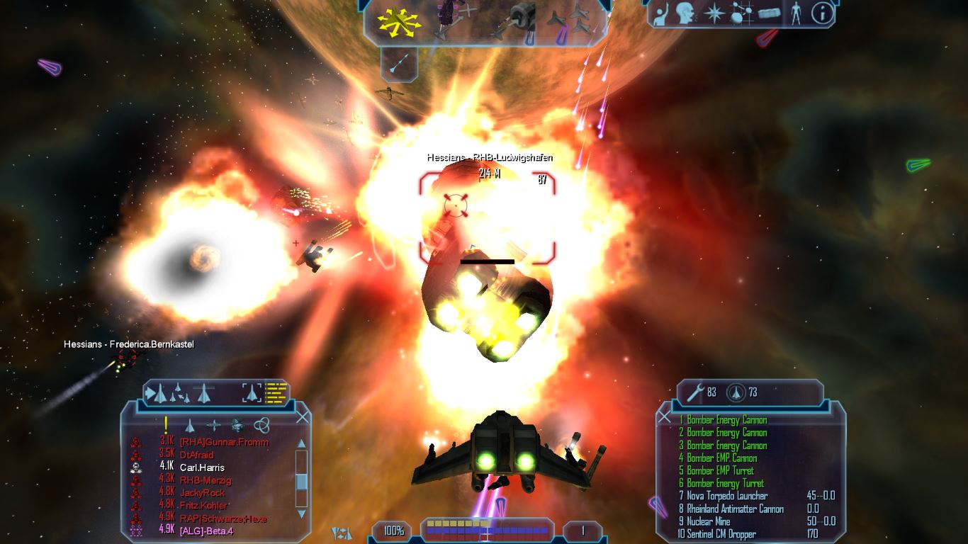

I don't think anyone could disagree with these choices. Incredible games with great HUDs.
Yay, thanks!
Hi Brian, really enjoyed this and part 1 (and am now voraciously devouring the rest of the site). Very timely for me, as I'm agonising over cockpit vs cockpitless for a current project. Top job!
Yay, glad you're enjoying it! And what's your project?
Absolutely nothing of note; merely Yet Another Elite Clone ;)
Well doooooooooooooo tell. Maybe we can make an article out of it promoting your project. :)
Brian, I'll hook you up with a preview build as soon as the thing's somewhat fun :P
AWESOME! Thanks!